
前回は、適合率/再現率曲線を実際に描いてみた。
理由は、正解率をチェックするだけでは不十分だからだ。
例えば、癌や新型コロナの陽性を発見するタスクでは、陽性患者を陰性と判定してはマズいので、陰性の患者を陽性と診断して、再検査したほうがマシというパターンもあるからだ。
今回は、Machine Learningの性能評価に使える別のツールのROC曲線を使ってみよう。
ROC曲線とは
ROC曲線は、適合率/再現率曲線とにているが、真陽性率(=TPF: True Positive Fraction)と偽陽性率(=FPF: False Positive Fraction)を計算し、縦軸にTPF、横軸にFPFをとった平面にプロットして線で結んだグラフだ。FractionのかわりにRateと呼ぶこともある。
点の数が多くなると曲線のように見えるので、ROC曲線という。
もとは、レーダー技術で、雑音の中から敵の存在を見つける方法として開発された。
真陽性率 = TP / (TP + FN) であり、実際に陽性のもののうち、陽性と正しく予測できた割合で、再現率と同じだ。
偽陽性率 = FP / (FP + TN) であり、実際に陰性のもののうち、陽性とまちがって予測した割合だ。
この曲線から、どのポイントを採用するかは、検査の位置付けやその他の条件によって決定されるので、ここでは曲線の描き方にフォーカスしてみよう。
ROC曲線のプロット
ROC曲線を描くには、roc_curveライブラリをインポートしてroc_curve()関数を使おう。
パラメータの意味はこちら。
y_true:array, shape = [n_samples]

    True binary labels. If labels are not either {-1, 1} or {0, 1}, then pos_label should be explicitly given.


y_score:array, shape = [n_samples]

    Target scores, can either be probability estimates of the positive class, confidence values, or non-thresholded measure of decisions (as returned by “decision_function” on some classifiers).
y_trueには、以前定義したy_train_5 = (y_train == 5)を使い、y_scoreにはy_scores = cross_val_predict(sgd_clf, X_train, y_train_5, method=”decision_function”)を使ってみよう。
すでに定義済みなので、新しく定義しなくても大丈夫だ。
戻り値は、つぎの3つだ。
fpr:array, shape = [>2]

   Increasing false positive rates such that element i is the false positive rate of predictions with score >= thresholds[i].


tpr:array, shape = [>2]

   Increasing true positive rates such that element i is the true positive rate of predictions with score >= thresholds[i].


thresholds:array, shape = [n_thresholds]

   Decreasing thresholds on the decision function used to compute fpr and tpr. thresholds[0] represents no instances being predicted and is arbitrarily set to max(y_score) + 1.
繰り返しになるが、fprは、False Positive Rate(偽陽性率)で、アラートしてはいけないもののうち、アラートをだしてしまったものの割合だ。
tprは、True Positive Rate(真陽性率=再現率)で、みつけるべきもののうち、それが実際に欲しいものである割合だ。
では、実際にplot_roc_curve()を使ってプロットしてみよう。
from sklearn.metrics import roc_curve

fpr, tpr, thresholds = roc_curve(y_train_5, y_scores)

def plot_roc_curve(fpr, tpr, label=None):
    plt.plot(fpr, tpr, linewidth=2, label=label)
    plt.plot([0, 1], [0, 1], 'k--')

plt.xlabel('FPR: False Positive Rate')
plt.ylabel('TPR: True Positive Rate')

plot_roc_curve(fpr, tpr)
plt.show()
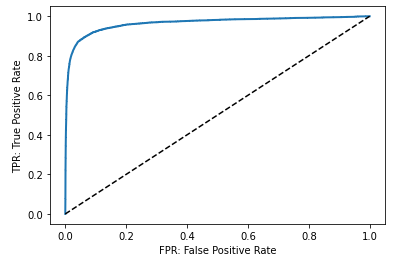
みてのとおり、TPRが高くなるとFPRも高くなる。
まとめ
ROC曲線は、判定がどれぐらい有効なのかを知る時に使われる。
また、ある値以上は陽性だと判定する閾値をどのように設定するかによって感度(陽性率)と特異度は変化していくので、陰性と陽性を分けるカットオフ値をみつけることが重要になってくる。

コメント